

He was able to capture the colour of a flower and then use it for walls and stairs. Meet Luis Barragán, an enthusiast and visionary who added missing colours into the panorama of a city.
Colour in architecture is a tricky subject. Choosing the right colours and shades requires sensitivity, talent and knowledge. In the space of the last two decades, Poles have learned that it is not an easy or intuitive art. A festival of thermomodernization has been going on in our country. Most housing associations and boards of homeowner associations try to outdo one another in painting the façades of their blocks of flats and tenements with increasingly gaudy colours, not uncommonly without prior consultation with an architect or an artist. You don’t need to be an art graduate to realize that this is not always for the best.
Of course, it’s not always the amateurs’ fault. Architects can take things too far in the opposite direction. They usually avoid strong colours, they dress in black and their buildings are often in shades of grey, black and white. After all it’s about space, and colours only disturb its perception. Nothing could be further from the truth. Indeed, wrong colours obstruct, but if they are well-chosen, they can add a lot of charm to a building and the space itself.
An architect like a diamond
Some good examples of this are the buildings created by the most famous 20th-century Mexican architect, Luis Barragán. Recently, he’s been the centre of attention again, because a certain American artist – Jill Magid – decided to turn some of his ashes (with the family’s consent) into a diamond. The reason? She wanted to gift it to Federica Zanco, the head of Barragán’s archives.

As stated in his will, his vast archives were divided into two parts: a private one and a professional one. The personal collection remained in Mexico, in the architect’s home and studio. In 1995, Rolf Fehlbaum, president of the Swiss furniture company Vitra, bought the professional part of Barragán’s archives, including the rights to the use of his name, managing the copyrights, and the rights to his works. He gifted them to his fiancée, the architect Federica Zanco, as a wedding gift (supposedly instead of an engagement ring). Even though Zanco publicly announced that the archive would be open to the public, it’s been 20 years and it has remained closed. As part of her artistic work, Magid came up with the idea of ‘making up’ for the lack of a ring and turning the exhumed ashes of the architect into a two-carat diamond. In exchange, the archives were supposed to go back to Mexico. A documentary film was created on the occasion of this rather macabre happening. Several pieces also appeared in well-read international journals, but nothing else happened. The archives remain where they were.
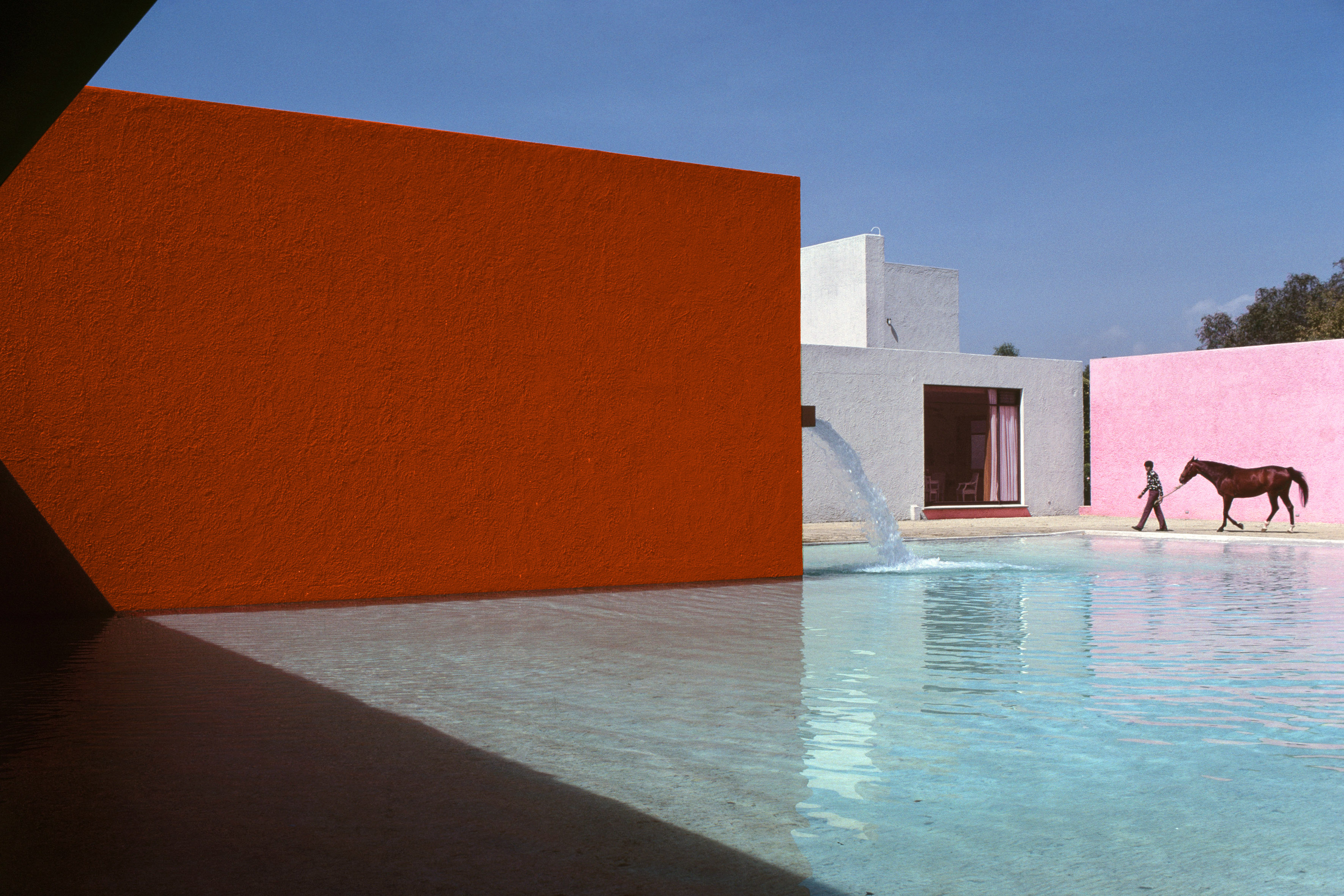
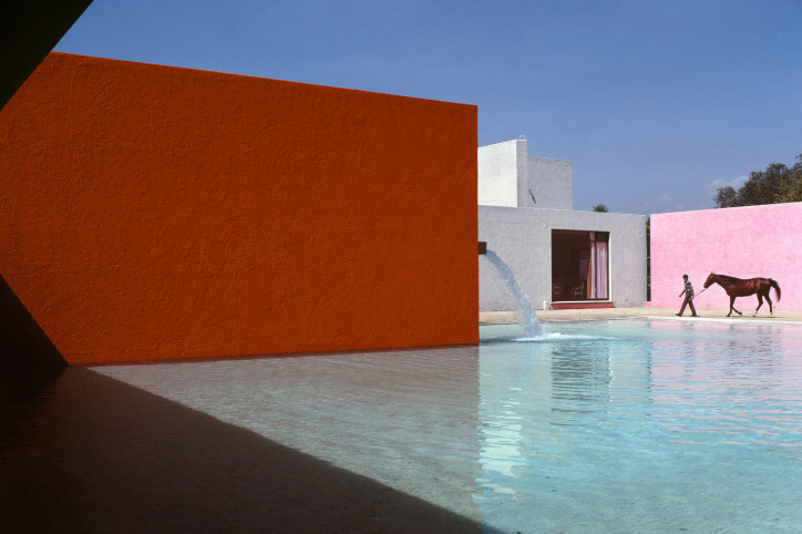
Why is Luis Barragán so famed and admired (to such an extent that he was even disturbed after death)? Well, his modernist houses, geometrical and restrained in form, stand out with their exceptional revue of colour, enriching the world of modernist architecture with a completely new theme.
Early inspirations
Luis Barragán was born in 1902 in Guadalajara in Mexico. He spent his childhood in the town of Mazamitla, on the estate of his father, a rich landowner. This idyllic life in a typical Mexican hacienda hugely influenced his sensitivity and later fascinations. He was inspired by the motifs of horses, lush, colourful vegetation, and water and fountains.
In 1925, after graduating as a construction engineer, Barragán travelled to Europe. He spent two years there. He travelled extensively across the Mediterranean countries, with a special emphasis on Greece and Spain. One of the most important events from this period was his meeting with Ferdinand Bac, the French cartoonist and landscape designer (Bac decided to turn to landscape design as late as the age of 50!). Even though at the time European architecture was undergoing a revolution with the international style promoted by Le Corbusier and Gropius, Barragán was more intrigued with traditional Spanish houses and Mediterranean gardens. Especially those designed by Bac, which, as the Mexican thought, expressed the modern style of the region. The structures of garden pavilions were supposed to be simple in form, made of local materials. A home, garden and landscape should be an integrated whole. Warm colours dominated: shades of ochre, pink and yellow. Visions of those gardens and colours stayed with Barragán till the end of his life.
Spiritual freedom
In 1936, Barragán moved to Mexico City and abandoned the traditional ways of construction that he had followed for the first 10 years of his professional career. He gave into the modernist fad and started building houses with white walls, large glazed surfaces and slim columns. In the meantime, he was busy with property development. Towards the end of the 1940s, as part of one of his bigger projects, he built his own home. Here he changed his approach again. This is how he justified it in a 1962 interview: “The use of enormous plate windows, which are totally unsuited to our – or any other – climate. They deprive our buildings of intimacy, the effects of shadow and atmosphere. […] We have lost our sense of intimate life and have become forced to live public lives, essentially away from home.”
The street-facing façade had only a few small, square windows. From the garden side, the house was surrounded by a few-metres-tall wall. And only the window from the living room, overlooking the lush garden filled with greenery, stretched across the height of the whole storey. This was how one of Barragán’s main spatial concepts was born. Tall walls were to frame the views, but also to create some shade. In places such as Mexico, with its cloudless skies and high temperatures, shade is priceless. Barragán minimized direct visual contact with the sky. As he put it: “Architects are forgetting the need of human beings for half-light, the sort of light that imposes a sense of tranquility, in their living rooms as well as in their bedrooms. About half the glass now used in so many buildings – homes as well as offices – would have to be removed in order to obtain the quality of light that enables one to live and work in a more concentrated manner, and more graciously. We should try to recover mental and spiritual ease and to alleviate anxiety, the salient characteristic of these agitated times, and the pleasures of thinking, working, conversing are heightened by the absence of glaring, distracting light.”
A colourful jigsaw puzzle
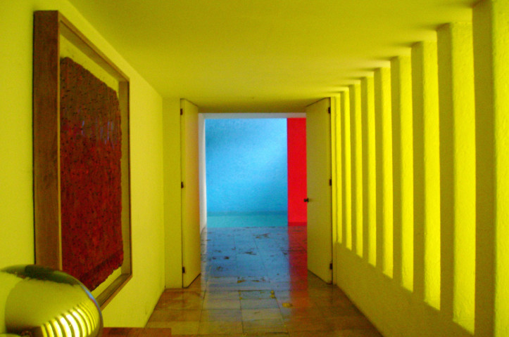
Barragán strived to create an atmosphere of mystery, peacefulness and beauty in architecture. He could achieve all this also thanks to the use of colours, which became his trademark. No other architect in the entire 20th century took such care to examine the influence of colour on the space surrounding us and on our psyche. Colour applied to the walls was not just a mere decoration, but also – or perhaps first and foremost – the most basic element of spatial composition. The perception of colour was heightened by the texture of the wall, devised by Barragán. Its roughness or smoothness made a big difference to how the light reflected from it, how the shadow imposed on it, and therefore how the colour changed.
The architect used a very particular colour palette. It was a counterpoint to the stark, white walls used so eagerly by modernists, and technically speaking it had a much higher reflectance than white, which helped to function in such a hot climate, allowing the eyes to get some rest from the blinding sunlight. While choosing his colours, Barragán was inspired not only by the looks of traditional Mexican houses, but also by the local vegetation. That was why he often used pink, purple, rusty red and yellow. He was especially fond of the first of these colours. The exact shade came from the colour of bougainvillea, one of the most admired flowers in Mexico. The flowers of the flame tree inspired him to paint the walls rusty red. The purple was to imitate jacaranda flowers. At times, Barragán even painted his walls blue, to ‘extend’ the colour of the sky into patios. He also used ochre, the colour of local soil.
Perfect likeness
Barragán used to spend long hours analysing light and colours – he was obsessed with them. According to legend, when he was bed-ridden in the last months of his life, he kept a sheet of Mexican pink paper by his pillow. He stared at it, touched it with his fingers. Sheila Hicks – the artist who worked with the architect at the turn of the 1950s and 1960s – recalled that Barragán spent days comparing a colour swatch to paintings by his friend Jesús Reyes Ferreira, who used typical Mexican colours in his works. This was a painstaking, analytical work that went on for days, months, years. As a matter of fact, pretty much all of Barragán’s clients quickly found out that he was a perfectionist. Barragán could build a huge wall one day, only to take it down the following day. “I pictured it differently,” he would say. Yutaka Saito, a Japanese architect who did research into how far the colour shades chosen by Barragán matched the real colours of flowers they were modelled on, has proven that it was the perfect likeness.
In Barragán’s entire palette we don’t find the colour green. There is a reason for this. The climactic zone where central Mexico is located means that green is ubiquitous there. That’s why the colours used by the architect were to supplement the existing landscape. His buildings also show – especially the ones created in his later life – that architecture can combine tradition and contemporaneity, restraint and joy, calmness and vitality. He created modern, cubist homes, using local materials. He played with texture to show that large surfaces, so close to modernists’ hearts, don’t have to be alienated entities in the middle of landscape. They can instead present themselves as organisms undergoing constant change. At the same time, just in his choice of colour, he was able to turn the local landscape into a beautiful, abstract composition that Rothko himself would be proud of.
So when I see our blocks of flats and tenements glowing with their pastel colours, I think that there is nothing wrong with wanting to bring some life into our grey reality. But we need somebody who will first test, see, compare with a swatch, try to understand what kind of light we have (and what kind we don’t have) and then carefully choose the best shades. If it doesn’t work, we can simply come back, tear it down and build anew.
Translated from the Polish by Anna Błasiak
Read similar: