

The vibrancy of this color has appealed to us for centuries—from medieval monks decorating books to designers of NASA spacesuits. Orange is everywhere, though sometimes it’s hidden.
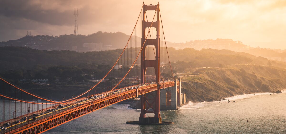
The Golden Gate strait is straddled by the famous bridge of the same name. Countless photos have captured the landmark swathed in dense fog, looking like the mouth of a mighty siphon spouting clouds of soft white. It is then that the bridge’s color is most visible: intense, surprisingly in tune with the green and gold of the nearby hills, with the deep navy blue of the bay water, with the white of the fog. If you ask people to name the color of the Golden Gate Bridge, most will say some variety of red, before stopping to reflect on their response. After all, its name contains the word “golden,” suggesting that it might not really be red. Maybe the perceived color of the structure is simply the result of an optical illusion, or an unusual contrast with the brightness of the Californian landscape.
The news that the bridge is actually orange might come as quite a surprise, but once aware of this fact, we will forever see its span and towers in a deep, saturated shade of orange. That’s the funny thing about colors: the most basic ones—green, red, blue, yellow—are easy to classify. But when it comes to those shades squeezed between the well-distinguished regions of the rainbow spectrum, it gets a little more complicated. On the color wheel, they always lie on the border of those defined and indisputable hues. They are annoyingly fluid: to one person, they seem completely obvious, while to another, they are a hard-to-label mixture of the more distinct colors. For where does yellow end and red begin? Other than measuring the shade and expressing it in dry numerical form, how can one say what orange really is?
Square Meters of Orange
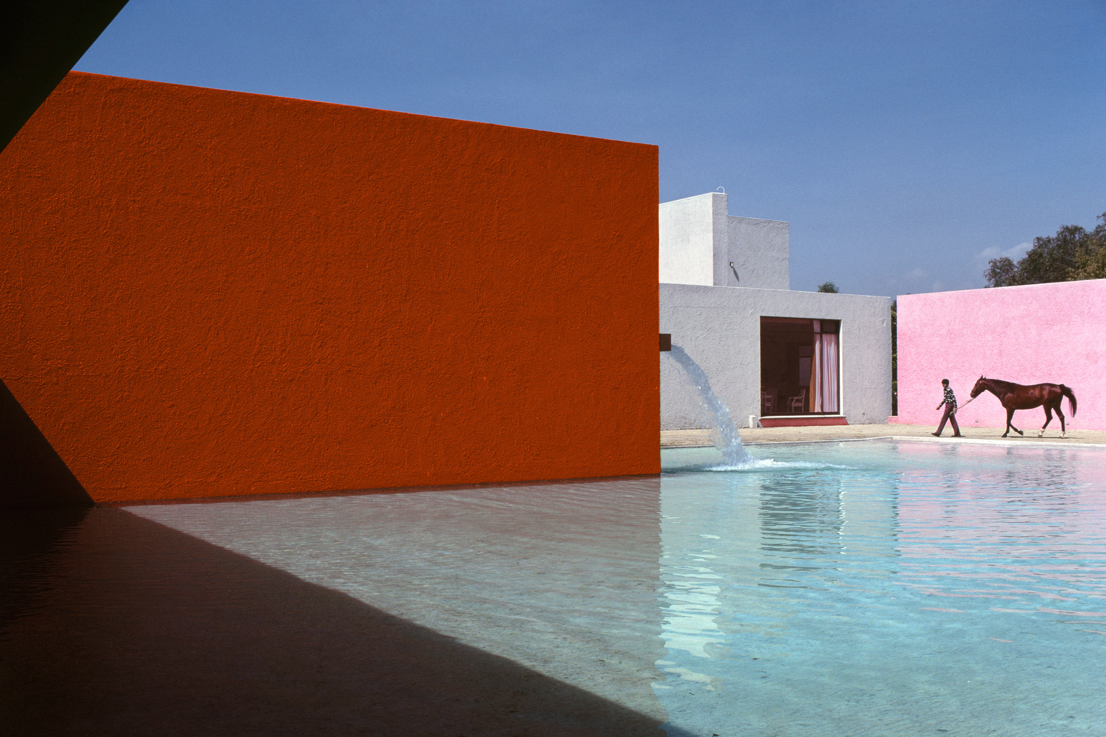
In fact, the color of the Golden Gate Bridge is not just any orange. For a long time, the actual variant, carefully selected, was kept a secret. Those enamored with the bridge’s bright silhouette to the extent that they tried to paint their homes, bikes, and cars in the same shade had little to work with. “Golden Gate Orange” only existed in the form of hundreds of gallons of thick paint, stored in barrels weighing several hundred pounds. To this day, there is an underground bunker near the structure containing a large supply of this unique substance. The bridge needs regular repainting, as it is constantly subjected to the corrosive effects of the cold fog and salty waters. Almost every day, a few people are at work filling in the gaps and deteriorations in the colored coating, which covers more than a hundred million square feet of the steel structure. Nowadays—although it is still impossible to get a sample of the original paint—one can easily create their own version of Golden Gate Orange. In the language of color alchemy, it is #F04A00, which is a mixture of 240 parts red to 74 parts pure green. In the parlance of specialists, this is known as “International Orange.” This color existed long before the bridge was erected, and the shade that lights up the Golden Gate openwork structure is essentially a slightly modified version.

The choice of orange was no accident. International Orange is widely used when an object needs to be clearly visible against almost any background. It is therefore the color of choice for warning signs on US roads, many structural elements and technical devices in air transportation, and even the intravehicular activity spacesuits worn by astronauts on board NASA space shuttles between 1994 and 2011 (affectionately referred to as “pumpkin suits” because of their color and shape). International Orange was intended to improve the visibility of the Golden Gate Bridge structure in all weather conditions. But there’s something else. One of the original plans of the US military, who were initially responsible for keeping the bridge in good condition, was to paint it in black and yellow stripes. For the architects of the bridge, this idea was so awful that the head architect himself, Irving F. Morrow, was forced to comment. One day, he noticed a wide streak of beautiful orange paint—International Orange, as it happens—that had been used on the gray steel as a marker. This color occupied Morrow’s thoughts to the extent that he composed an entire manifesto entitled “The Golden Gate Bridge Report on Color and Lighting.” He wrote as follows:
Fortunately, it is not necessary to make a decision [about the color of the bridge] on theoretical considerations alone, for there have been two practical demonstrations of the ideal color. During the erection of north tower, and again at the present moment with the south tower assuming form, observers from all walks of life have been universally impressed by the beauty of the structures in the shop red lead coat. This color is luminous, undergoes atmospheric changes with great beauty, is prominent without insistence, enhances the architectural scale to the utmost and gives weight and substance at the same time that it is light enough properly to register variations of shade and shadow. In short, it is the ideal color from every point of view, and is hereby recommended and urged as the most appropriate and satisfactory color for the finished bridge.
Poisoned Pigment
The fiery hue of the Golden Gate Bridge is the result of a bright pigment based on lead tetroxide. In its pure form, this compound—colloquially called “minium” (from the town of Miño on the Spain-Portugal border, Minius during the Roman Empire)—is brick-red in color. Minium is known to form an excellent bond with metal surfaces, so it is commonly used in the painting of iron structures to protect them from corrosion and weather conditions. Like all other lead compounds, minium is a highly toxic substance. Although surfaces painted with it are not dangerous—the lead is not released in quantities that could cause poisoning—it should be handled with caution, especially when used in its raw, powdered form, when it can easily be sprayed into the air. If the aerosol of the dye is inhaled, there is a risk of absorbing a dangerous dose of toxic lead.
Of course, the bad reputation of minium was not known in the Middle Ages, when the fieriness of the pigment and the ease with which it was obtained (especially compared to another equally toxic orange dye: cinnabar) made it one of the favorite shades for monastic scribes who spent their days copying out bulky manuscripts and books by hand. Thanks to its exceptional durability and above-average capacity for covering painted surfaces, minium soon began to be used in the creation of the ornate first letters signifying a new paragraph or section of text. In medieval manuscripts, they were very often inscribed with tiny, elaborate illustrations called miniatures. Although the word “miniature” refers today to a small object or work of art created in a small format, it originally meant those letters illustrated in fiery orange. Shut away in their dark, stuffy scriptorias, the monks probably had no idea about the toxic effects of minium—just as they were unaware of the poisonous properties of many other pigments (e.g., lead white, arsenic green, or cinnabar). Therefore, poisoning caused by licking a brush dipped in fire-colored paint, or inhaling powdered lead oxide, was par for the course.
The Great Omnipresence
The world of widely used orange pigments is surprisingly small. Other than fiery minium and cinnabar, only those dyes obtained from orpiment (a toxic yellow-orange mineral, a sulfide of arsenic) were of any historical significance. The orange palette of dyes produced by living organisms is rather more intriguing. In the temperate climate zone, there is a display of orange virtuosity each fall as green leaves turn golden due to the production of orange pigments permeating every leaf cell.
The omnipresence of orange is hard to believe; and yet, without the green dye chlorophyll, our planet viewed from space would look like a fireball. In that world, the Amazon rainforest that covers vast swaths of South America would be a huge plane of bright orange, cut through by the dark line of the Amazon River. Chlorophyll—a green pigment containing magnesium, and a key component of the photosynthesis process—masks the presence of orange, yellow, and red pigments in plant tissues. High school biochemistry lessons detail how chlorophyll plays a major role in capturing light energy and converting it into chemical energy in the form of chemical bonds of high-energy sugars. Indeed, chlorophyll is the basic photosensitive material in the photosynthetic reaction centers—huge protein complexes encrusted with green pigment that are responsible for carrying out the initial, key stages of photosynthesis. It is in these centers that light radiation is absorbed and electrons are transferred to the machinery that performs the alchemical art of converting carbon dioxide into sweet carbohydrates. But besides chlorophyll, leaves also contain other pigments which, although they are invisible in the flood of greenness, play an equally important role.
Carotenoid Bravura
Most plants have yellow-orange and yellow-red pigments from the carotenoid group in their chloroplasts. These include red and fiery orange lycopenes and carotenes, as well as yellow-orange xanthophylls. Their molecules look like long zigzags with carbon ring heads at either end. The atoms from which they are built are connected by double bonds; the electrons in such bonds are extremely labile and easily excited under the influence of light or when they come into contact with other high-energy, aggressive molecules. The excited carotenoids can transport captured energy via the electrons jumping along their molecules, carrying it toward the chlorophyll photosynthetic centers. In this way, they act as additional “antennas” that capture light radiation with a slightly different color than that captured by the chlorophyll molecules. What’s more, thanks to their ability to react with the dangerous molecules belonging to the so-called aggressive forms of oxygen, the carotenoids are involved in detoxifying the interior of light-bathed cells, transferring the energy sucked from the neutralized toxins to the photosynthesis process. Their ubiquity can be seen in all its glory only when the chlorophyll in the leaves—deprived of the regular supply of substances transported through the plant’s conducting system—degrades and decomposes. This happens when the plant dies, but also when it becomes dormant, anticipating the imminent arrival of winter. As one of the most costly and sensitive organs of the plant body, the leaves would be a heavy burden on the organism as it survives the tough weeks of cold weather and recovers through the spring. Perennial plants—especially trees and shrubs—living in seasonal environments therefore discard their leaves, but not before they pump out everything of value. Deprived of their green chlorophyll mask, the leaf tissues reveal their fiery pigments, turning green ecosystems bright orange for several weeks.
Researchers have long wondered why carotenoids are not among the compounds removed from the leaves before winter: after all, their extremely important biological role can hardly be defined as less important than that played by chlorophyll. As it turns out, plants appear to have a self-interest in their autumnal orange transformation. The color of fall leaves on trees and shrubs can be an important signal for recipients who know how to read the message. There are many hypotheses that attempt to explain this communicative function. According to some, the leaves act as an unmistakable flag directing fruit-eating creatures to the fall-ripened fruit, thereby increasing the plant’s chances of spreading its seeds. There are also studies on the deterrent role of the golden hue: in addition to carotenoid pigments, the pre-winter discolored leaves also contain anthocyanins and a number of other substances of a protective and pesticidal nature. The fiery color could therefore be a signal discouraging potential pests from setting up home on the plant’s body, which is entering a phase of winter dormancy that is critical for its physiology. It is also possible that the leaves that fall to the ground, filled to the brim with colorful pigments, are involved in securing the interests of the plant by a process called allelopathy, i.e., impeding the growth of seedlings of new specimens, which could constitute undesirable competition for the original plant in the future.
How interesting that such an indefinable color that eludes classification—for some, too red or too yellow to deserve its own category—is actually the most widespread in nature. Were it not for neon-green chlorophyll, we would all be living in a world of orange-golden glow. Perhaps then orange, not green, would be the color of hope and comfort that is so often sought in spaces filled with greenery.
Read similar: