Colors Evoke Similar Emotions Around the World, Survey Finds
i
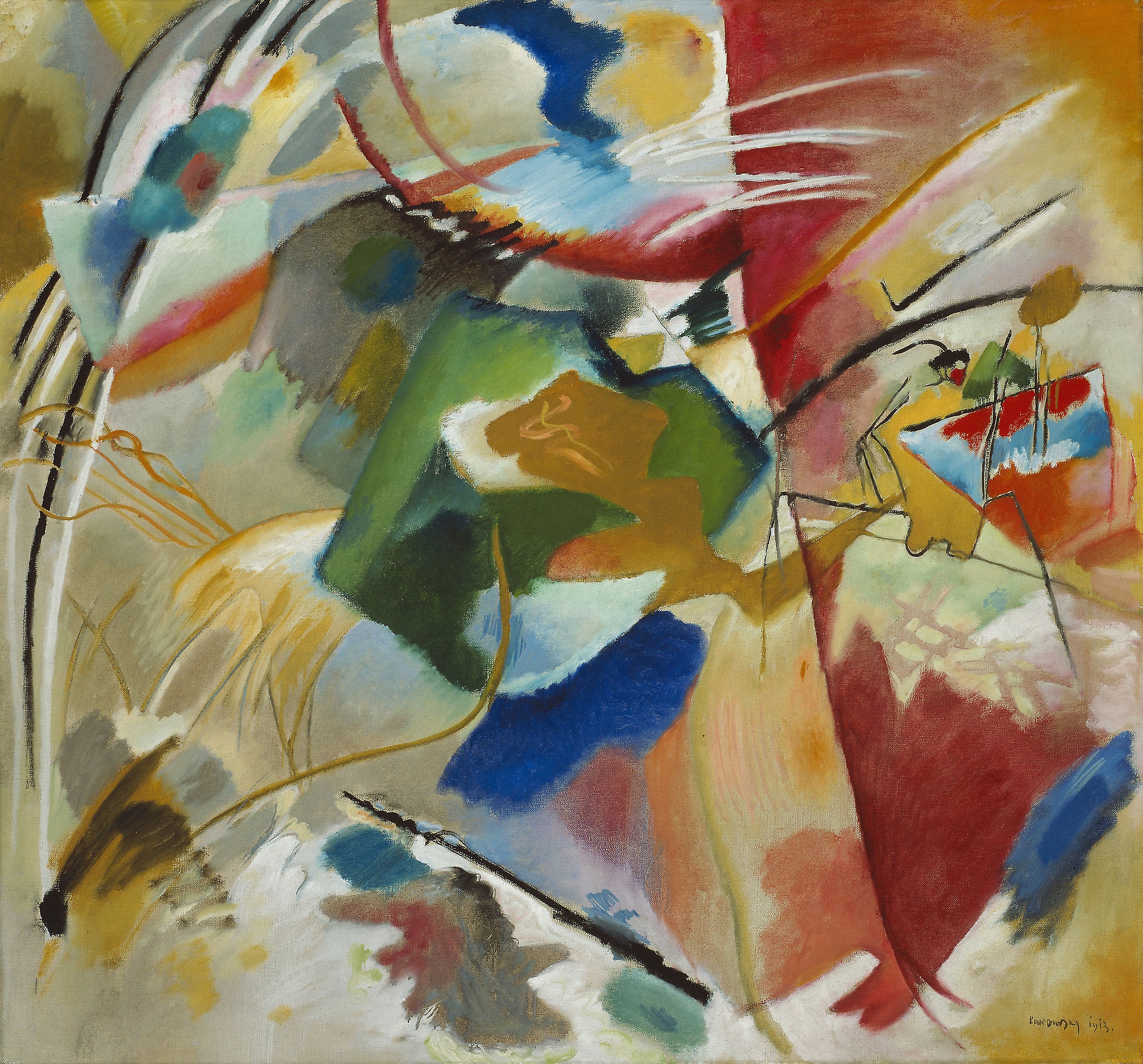
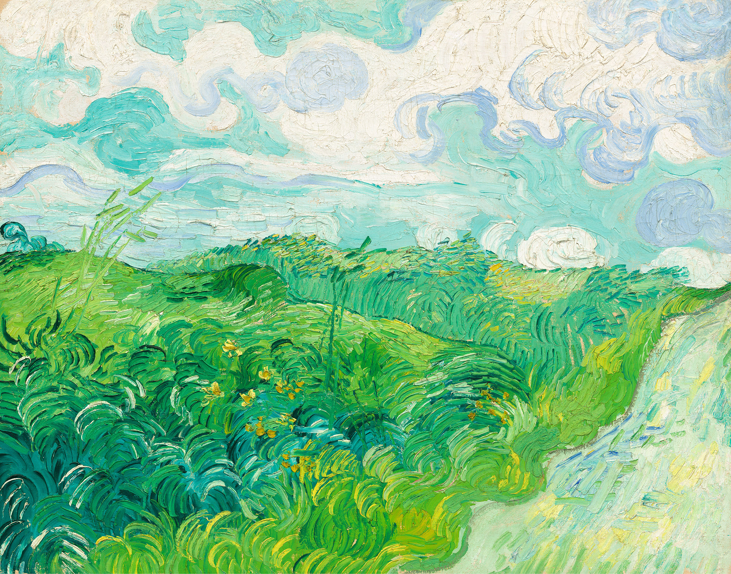
“Painting with Green Center” by Vasily Kandinsky, 1913
Good Mood

Colors Evoke Similar Emotions Around the World, Survey Finds

Jaimee Bell
Reading
time 3 minutes

Certain colors are globally linked to certain feelings, the study reveals.

People associate colors with emotions (green for envy, blue for sadness, etc). We see this portrayed in the media, in marketing, even in the clothes we choose to wear. A detailed survey of over 4,500 participants from 30 nations (spanning over 6 continents) explains that people from all over the world often associate the same feelings with the same colors.

“No similar study of this scope has ever been carried out,” said Dr. Daniel Oberfeld-Twistel, member of the participating team at Johannes Gutenberg University Mainz (JGU). “It allowed us to obtain a comprehensive overview and establish that color-emotion associations are surprisingly similar around the world.”

There is a very likely chance you’ve even been “fooled” by color marketing in the past, or you’ve chosen one product over another subconsciously due to colors that were designed to influence your emotions.

Information

Breaking news! This is the first of your five free articles this month. You can get unlimited access to all our articles and audio content with our digital subscription.

Subscribe

Companies that want to be known for being dependable often use blue in their logos, for example (Dell, HP, IBM). Companies that want to be perceived as fun and exciting go for a splash of orange (Fanta, Nickelodeon, even Amazon). Green is associated with natural, peaceful emotions and is often used by companies like Whole Foods and Tropicana.

Your favorite color says a lot about your personality.

Various studies and experiments across multiple years (2010, 2014, 2015, and more recently in 2019) have given us more insight into the link between your personality and your favorite color.

Red, for example, is considered a bold color and is associated with feelings such as excitement, passion, anger, danger, energy, and love. The personality traits of this color might be someone who is bold, a little impulsive, and who loves adventure.

Orange, on the other hand, is considered representative of creativity, happiness, and freedom. The personality traits of this color can be fun, playful, cheerful, nurturing, and productive.

Study reveals which colors best suit which emotions around the globe

In this particular survey, participants were asked to fill out an online questionnaire which involved assigning 20 emotions to 12 different color terms. They were also asked to specify the intensity with which they associated the color term with the emotion.

Certain colors are globally linked to certain emotions, the study reveals.

The results of this study showed a few definite correlations between colors and emotions throughout the globe. Red, for example, is the only color that is strongly associated with both negative (anger) and positive (love) feelings. Brown, on the other end of the spectrum, is the color that triggers the fewest emotions globally.

The color white is closely associated with sadness in China, while purple is what is closely associated with sadness in Greece. This can be traced back to the roots of each culture, with white being worn at funerals in China and dark purple being the Greek Orthodox Church’s color of mourning.

Yellow is more associated with joy, specifically in countries that see less sunshine. Meanwhile, its association with joy is weaker in areas that have greater exposure to sunshine.

According to Dr. Oberfeld-Twistel, it is difficult to say exactly what the causes for global similarities and differences are. “There is a range of possible influencing factors: language, culture, religion, climate, the history of human development, the human perceptual system.”

This article was originally published on 29th October 2020 at Big Think.

Also read:

What Do Colours Tell Us?
Experiences, Fiction

What Do Colours Tell Us?

A History of Colour in Art
Anna Arno

It seems that art can’t exist without them. They allow for the imitation of reality, draw the eyes, carry hidden meanings. The history of colour is a fascinating story of the changeability of human tastes and the power of our convictions, associations and… stereotypes.  

“When we are asked ‘What do the words “red”, “blue”, “black”, “white” mean? We can, of course, immediately point to things which have these colours, but our ability to explain the meanings of these words goes no further!” 
Ludwig Wittgenstein
 
Stendhal’s most famous novel was supposed to be entitled “Julien”, after the main protagonist. Later on the writer decided to go with The Red and the Black. “It’s a uniform and a cassock,” Tadeusz Boy-Żeleński explained. “It’s the two Frances: Napoleon’s France and the Bourbons’ France.” Such is the most common interpretation of this enigmatic title. However, the red’s link to the army is not clear-cut, as Napoleonic uniforms were blue. That aside, red and black evoke numerous other associations. Love and death. The colours betted on in roulette. Julien Sorel also speaks of “black ambition”, which could be counterbalanced by passionate red… Stendhal surely liked the ambivalence of his colouristic title – right after The Red and the Black, he started working on a book called The Pink and the Green.
 
A man turns purple with fury, goes white with fear, or falls into black despair. But there are also days when he is feeling blue or looks at the world through rose-coloured spectacles. Colours rouse strong emotional associations and carry symbolic meanings. However these – depending on the historical time and place – can differ, and even be contradictory. Colours, which in some periods were associated with savagery, the Devil or crime, in other periods won back their prestige as royal or even divine.
 

The Greek tetrad of colours

 
Up until the 19th century, it was thought that the ancient Greeks didn’t hold colours in high esteem. “There are four colours, in accordance with the number of the elements: white, black, red and yellow,” wrote Empedocles, followed by Plato in Timaeus. But what about the blue of the sky and the green plants of spring? Homer compared the colour of the sky to copper and iron, and that of the sea to wine. For us these are strange associations, but the poet was supposedly blind. Some even speculated that the eye structure developed after the ancient times, and that the Greeks couldn’t distinguish all shades. The Roman architect Vitruvius praised the ascetic approach of Greek painters: “The fact is that the artistic excellence which the ancients endeavoured to attain by working hard and taking pains, is now attempted by the use of colours and the brave show which they make, and expenditure by the employer prevents people from missing the artistic refinements that once lent authority to works.” But it is not true that the Greeks couldn’t tell colours apart or kept them in disdain. First, they preferred the colours of civilization over the colours of nature. Second, they distinguished between ‘painting proper’ and architectural decoration. And, at least since the end of the 18th century, we have known that Greek statues were not snow white. They were indeed painted, quite vividly too, and what’s more – not at all realistically (for example, hair was ‘dyed’ blue).

Nonetheless, the false image of naked marble has proven particularly lasting. The entirety of neoclassical aesthetics was based on it – from Canova’s Amor and Psyche, to the White House. According to these criteria, whiteness was a synonym of beauty and good taste, while colour was barbarity, debauchery and vulgarity. There is even an erotic subtext: male, distinct whiteness was juxtaposed with sensual, blurry colours. Johann Winckelmann, known as the father of German art history, declared that the whiter the body, the more beautiful it was. While examining works of art excavated in Pompeii and Herculaneum, he noticed the remnants of pigments. He could not come to terms with this; he came to the conclusion that the ginger-haired Artemis in red sandals must have been created by the Etruscans. Even Goethe insisted that only barbarians, simpletons and children had a weakness for colour. Sophisticated people avoided garish-coloured clothes and on an everyday basis surrounded themselves with toned-down shades.

Continue reading